The Butcher's Truck
Food Truck App
Project Type
Date
Location
Role
UX/UI Design
Octber 2023 - March 2024
Essex, United Kingdom
UX Researcher, Interaction Designer, Visual Designer

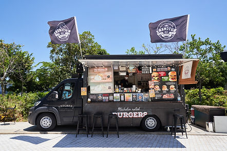
The Butcher's Truck
Background
The Butcher's Truck is located in Central, Hong Kong. It is a bustling area with a high density of professionals who value their limited lunch break. Being a popular food truck in this area, they attracts many customers, leading to long queues and wait times.
Product Goal
The goal of the app is to enhance the customer experience by allowing them to order food and drinks directly, reducing waiting time and making the process fast and smooth. This will make ordering from the truck a pleasant experience even in the busy and fast-paced environment of the area.
User Interview
Interviews were conducted among professionals working in Central to gain insight into their lunchtime habits, preferences, and pain points related to ordering from The Butcher's Truck.

Research
Findings 1
Excessive waiting time
On average, customers wait 15-20 minutes in line to order and pick up their food during peak lunch hours, this significantly reduces their available time to enjoy their meal and relax before returning to work, creating frustration and inefficiency.
Findings 2
Menu Clarity Issue
Customers spend 2-3 minutes reviewing the menu before ordering, with 40% reporting difficulty understanding some menu items. This confusion often leads to additional questions for the food truck staff, further slowing down the order process.
Findings 3
Payment Preference
The majority of customers (70%) prefer using digital payment methods such as mobile wallets and credit/debit cards. Additionally, 50% of customers discover the food truck through social media, 30% via word-of-mouth, and 20% by physically noticing the truck while walking in the area.
Competitive Audit
Existing food ordering, delivery apps and food truck apps were analyzed to identify strengths, weaknesses, and best practices that could be applied to the solution.


The pain points identified with these apps can be summerized to
1: Unappealing visual
2. Complicated user interface and overwhelming informations
3. Difficult to navigate around the app and complicated food ordering flow
Personas
Personas and User Journey Map were created representing typical users, capturing their goals, behaviors, and frustrations.


Storyboards
Big-Picture and Close-up storyboards were created to illustrate how the flow of using the app should be.
Ideation and Concept Development


Sketches
Big-Picture and Close-up storyboards were created to illustrate how the flow of using the app should be.


Low Fidelity Wireframe and Prototype
Lo-fi wireframes and prototypes were created to demonstrate the basic layout and user flow of the product.
A usablity study was done later to gain insight on what potential pain points users might face while using the app.


Two sets of prompts were created to see if users can complete basic tasks in the app.
Set 1
Prompt 1. Locate the "New Items" menu and add an item to cart
Prompt 2. Order a "Double Cheese Burger" and a "Chilli Hot Dog"
Set 2
Prompt 1. Add an item to "Favorite"
Prompt 2. Order a "Double Cheese Burger" and an item from "Favorite"
Insight 1
Unable to see order details in payment section
Insight 2
Item information is not detailed enough
Insight 3
"Favorite" section is underperforming
Revised Version
A revised version was designed after all the feedback received from the usability study. Some layout was changed, but some remained similar. Additional elements like search bars or Favorite buttons was also added.


Menu Page
Larger category tabs was used rather than smaller squares. A search bar was also added for quicker access to items.

Old

New
Homepage
The "Greeting" page was removed, now users will go directly into the homepage where they can see newly released items and a quick access to the main categories.
Old
New
Design Solution


Menu Page
Grid with bigger tabs were used instead of a list, providing a more visually appealing design.
Old
New


Item Page
The layout of the item detail page stayed mostly the same, but a "quantity selection" and a Customizations section were added.
Old
New


Cart Page
The layout of the Cart page stayed mostly the same, "Add to Favorite" and quantity adjustment were also added for easier adjustments.
Old
New


Payment Page
Item names and prices had been added to the payment page allows users to have a final confirmation for the item they picked.
Old
New
Final Design
A revised version was designed after all the feedback received from the usability study. Some layout was changed, but some remained similar. Additional elements like search bars or Favorite buttons were also added.


Visual Designs
Color palettes used to provide a visually appealing design.
Secondary
#FFCB46
Primary
#2F2F2F
#3A7E3A
#276D83
#545878
#C9B654
#DC9596
#D44D5C


Future steps
Reflections
Product Features
- Include accesibility settings, eg. Light / Dark Mode, Text size etc.
- Ability to sort and filter items
- Implement a Loyalty and Reward program
As the very first UX/UI design project for me, the experience offered great insights and lessons. Here are some reflections I gained during different design phases of the project.
Research phase
- Depth of user research: For future project, the depth of my user research has to be improved and include a more diverse subject group
- Research analysis: The analysis I did was quite basic, for future projects I plan to refine my data analysis skills with using more advanced tools and technique to gain more high quality insights.
Ideation and concept development
- Ideation system: The ideation system needs to be refined, I was jumping around idea development and brainstorming very often, a proper ideation process would benefit upcoming projects.
Design and prototyping phase
- Prototyping: Different versions of lo-fi prototypes were made throughout the whole design process, I believe I spent too much time on the technical aspect while making ideas into an interactive prototype.
Product Testing phase
- Testing methods: I plan to incoporate different product testing methods like A/B testings to better understand users' needs and preferences.